
Developing Fluid Engine
Last month we shipped the biggest change to our core website editing experience in ten years: Fluid Engine, our newest drag-and-drop editor. Fluid Engine is a reimagining of Squarespace’s existing editing system that dramatically improves the usability of laying out blocks on a page while unlocking new design possibilities. We wanted to lean into familiar paradigms for moving and resizing, enabling freeform control of layouts while avoiding common pitfalls associated with absolutely positioning elements. This blog post addresses how we arrived at the implementation, in addition to walking through a few technical and user experience issues that were core to the development of this feature.
Research and Understanding
In February 2021, we completed six months of user research dedicated to deeply understanding how we could improve the usability of our editor. We identified three main opportunities: moving, resizing, and aligning blocks in our existing drag-and-drop experience, Layout Engine.
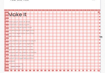
Layout Engine is a system composed of rows and 12 columns. Rows span multiple columns, and within a row you can have as many columns as can fit, such that their span sums up to the row’s width. Columns can then contain either a stack of blocks or rows, but cannot be empty (0 width or no blocks). This can be infinitely nested, while maintaining the relationship that widths and spans add up to their parent’s width, adding up to the root width of 12. There is no way to vertically space blocks out without adding a “spacer block.”
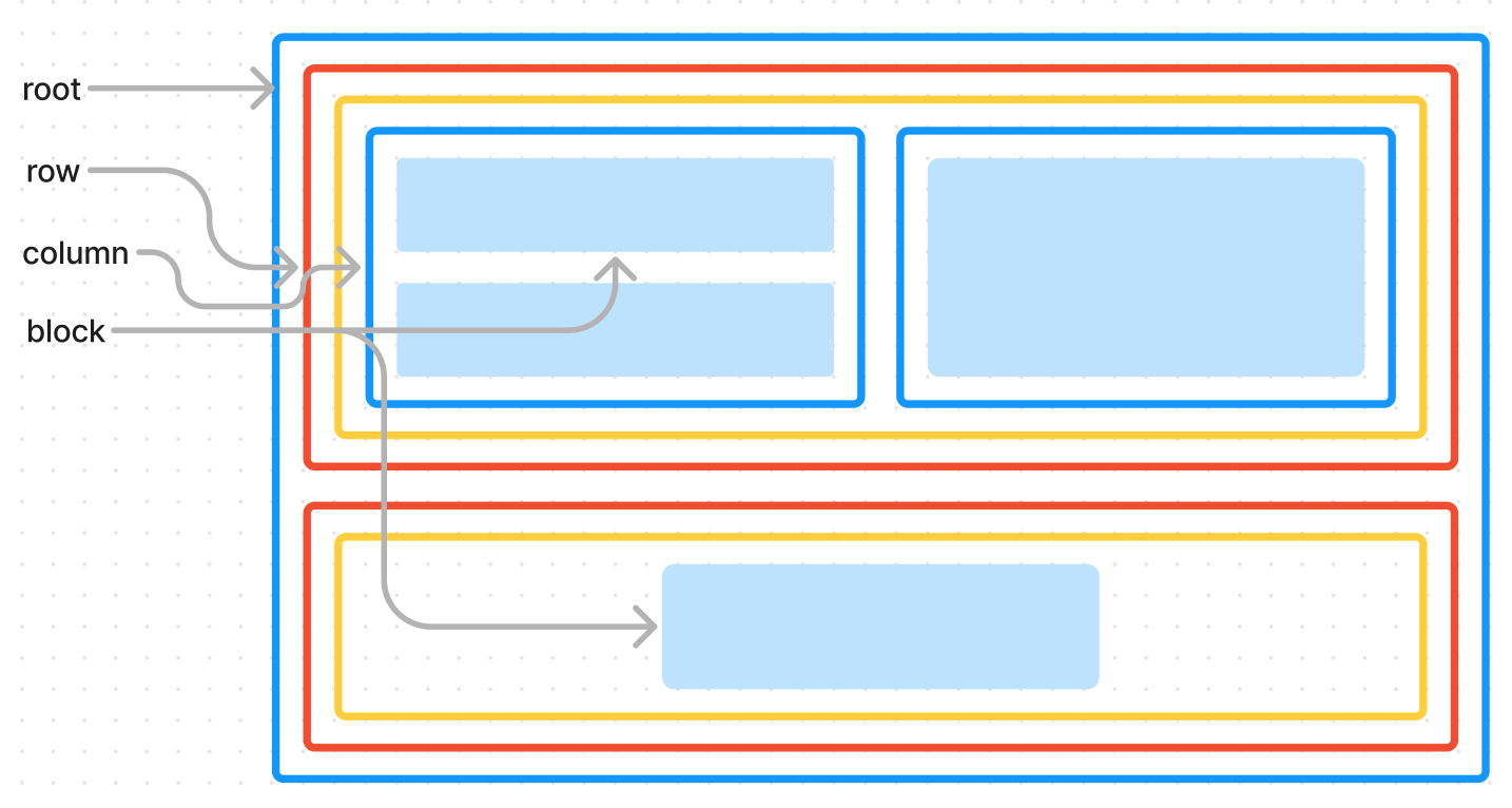
This structure allows users to quickly create various styles of layout. However, it causes user confusion with the opportunities listed above: moving, resizing, and aligning blocks. Specifically, because of the structure and invariant, most scenarios involving those actions shift more than just the block the user interacted with.
This was a central pain point for some users — moving and resizing introduced uncertainty resulting in unexpected layouts. This insight grew into our primary goal: moving, resizing, and aligning a single block should not affect other blocks. These actions need to be predictable, and we can achieve that by making them independent.
Prototyping
Two pivotal questions emerged: should we take each of these opportunities (moving, resizing, and aligning) one by one, iterate on them, and improve Layout Engine, or should we holistically evaluate and create a new system entirely? Have we pushed the current system to its limit, or can it be improved to allow for further independence and predictability?
Rather than answer right away, we started prototyping as many solutions as we could think of. We prototyped new systems altogether, we prototyped different UXs that produced the same data structure and markup as Layout Engine, we prototyped enhancements on top of Layout Engine, we prototyped and imagined scenarios with less drag-and-drop, and some with more. Throughout this process, we ran weekly user tests on our prototypes and incorporated those insights into next week's tests.
Ultimately, we learned that it was indeed time for a leap forward. Layout Engine was designed for blocks to be dependent — moving one block required rearranging the others to accommodate the rule that all widths must eventually add up to 12. No matter how far we pushed Layout Engine in our prototypes, we couldn't achieve predictability.
A Note On Website Responsiveness
It’s always important to remember that our end product is a website that can be viewed at any combination of screen width and screen height. This makes our drag-and-drop experience different from a tool like Google Slides, which users continually brought up in our testing as a comparison for what they expected. While our end goal with this entire project was to improve the editor experience and make it easier and even more delightful to build a site, the site itself needs to be beautiful and up to the standards and reputation that Squarespace has built within web design. This means that the site needs to be beautiful at every viewport size — not just the one our users are editing at.
Thus, while ideating on what a more ideal editor experience would look like, we were simultaneously iterating on the HTML and CSS this new system would generate.
First Steps
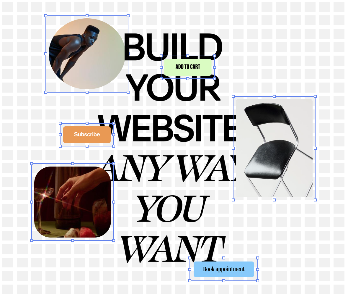
When designing a layout system to enable users to place blocks at arbitrary positions, resize blocks to arbitrary sizes, and maintain independence and predictability, the first thing that comes to mind is absolute positioning. With absolute positioning, we can store each block's x and y coordinates in pixels alongside their desired width and height, also in pixels. When we render the page, we then generate the corresponding CSS to add absolute positioning and sizing rules for all of the user’s blocks.
.block {
  position: absolute;
}

.block-1 {
  left: 22px;
  top: 83px;
  width: 300px;
  height: 120px;
}
This approach is great for usability! Users can position blocks wherever they want and moving, resizing, and aligning are all independent and predictable actions. Additionally, the UX can lean into paradigms the user is familiar with, like Google Slides.
This falls apart when viewed at different widths. Specifically, if site visitors size their browser window smaller than x + width for a given block, content will either be cut off, or will require horizontal scrolling, both of which are negative website experiences. Positioning this way is also bad for users with poor eyesight who rely on increasing their browser’s zoom, as doing so increases the chances that something will be cutoff and unreadable.

While we can solve the issue by defining a max width “safe zone”, this limitation becomes too narrow and restrictive and thus, a dealbreaker. We can improve on this method by storing percentages instead of pixel values for x, y, width, and height, alleviating the concern of cutting off content or horizontal scrolling at different browser widths.
This version works great for blocks that scale linearly: images, shapes, videos, for example, are all OK at variable sizes as long as their aspect ratio is preserved.
But what about something like the text block? The text block doesn’t determine its own aspect ratio the way an image does. Because of how text wraps, text block height is a function of the block width, text content, font styling options, and more.
Imagine a scenario where you have a button below a text block. As the browser is resized smaller, we’d expect the text to start wrapping, pushing the button down. Short of running JavaScript on our sites that repositions blocks based on screen width, this is unachievable with any absolute positioning and sizing system. In those systems, we’re presented with two options as text starts to wrap and make the block taller: hide overflow, cutting the content off, or overlay the text on top of what’s beneath. Both are poor experiences.
Our list of requirements continues to grow and seemingly feels impossible when viewed together:
Moving, resizing, and aligning blocks needs to be predictable and independent
Site content needs to be responsive and flow naturally at different browser sizes
Text wrapping as the screen gets narrower needs to push the content below it downward, and upward as the screen gets wider
Avoid running JavaScript on the visitor site that repositions blocks in response to width changes. Doing so decreases the performance of the site load, requiring loading and parsing before the first paint, as well as decreases performance after page load, adding computation that runs in response to browser resize events
How can we enable users to freely position and resize elements, but also enable those elements to be variable in height, pushing content down as they grow?
Enter the Grid
While these technical explorations were ongoing, our world-class Product and Design teams were exploring what would feel most intuitive for our users. We learned early on that exposing too much control to our users would be worse for their overall experience: with infinite choice comes less confidence in layout design. From this insight, we knew that we wanted to constrain where users could ultimately place blocks.
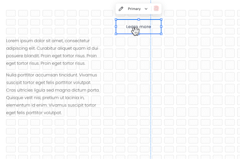
This exploration resulted in a grid: we would expose a 24-column grid on desktop and an 8-column grid on mobile, each with sensibly sized rows, giving users more fidelity than we offered with Layout Engine while still providing guidance and consistency across their site. Blocks are placed directly on the grid and maintain their own coordinates, allowing them to position anywhere and overlap, breaking the constraint of the current system that requires using spacer blocks for positioning. We settled on 24 columns after analyzing hundreds of our favorite websites, but structured the code and data model such that we can easily change this in the future as we learn more and get additional feedback.
As a quick aside: yes, we do construct a separate grid for mobile sites that has its own number of rows and columns and allows users to place blocks independently on each, creating beautiful and bespoke mobile layouts. Keeping them in sync and up-to-date warrants its own blog post, as it has a similar journey in complexity of UX and technology.
What happened next was a serendipitous moment between the technical, product, and design explorations. Since we would be exposing a grid to our users, what if we used CSS Grid under the hood to lay the blocks out? Not only would this give us the balance between flexibility and constraint that we were seeking, but it would mean we’re not reinventing the wheel.
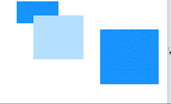
In a CSS Grid-based approach, we can construct a grid container that defines a number of columns and rows, with gaps between each cell. The columns would each be equal in size, changing width at different screen widths, and the rows would each be equal in size, determined by a system-defined value. Each block would then store an x, y coordinate pair for where it starts and an x, y coordinate pair for where it ends, in addition to storing properties like z-index and vertical alignment properties. These coordinate pairs are not pixel values, but rather, coordinates within the grid. When dragging to move or resize, we update the affected coordinates.

CSS Grid also has a property you can define when declaring your rows that indicates to the browser that it can stretch the row if needed:
grid-template-rows: repeat(var(--num-rows), minmax(var(--row-height), auto));
minmax allows us to define the minimum height of a row and a maximum height, allowing the browser to render the appropriate size. By setting a maximum of auto, we are instructing the browser to stretch the row to fit all of the content that is positioned in that row.
This means we can achieve the desired behavior of having a button below a text block, and, as the text starts to wrap, it pushes the button down. Under the hood, as the text wraps, the row itself is stretching and growing, which pushes all rows below the affected row downward.
In the gif below, notice that as the screen gets narrower and the paragraph wraps, the rows containing it stretch to become larger than the rows containing the button.
Suddenly, all of our requirements are falling into place. This system allows us to create both a great editor experience for our users, and a responsive and beautiful website that behaves as expected, all while embracing our users’ creativity and artistic expressions.
A Note On Row Stretch
There is one major issue the CSS Grid-based system introduces, however, when coupled with another one of our principles. We have a contract with our users that what you’re seeing while editing your site is a reflection of what your site will actually look like. Now that we’ve introduced “row stretch,” we lose row uniformity because some rows can be larger than others. This makes our drag-and-drop experience less predictable because we “snap” to grid coordinates — suddenly each snap moves a different distance.
If all the rows can be different sizes, how do we explain to users what’s happening? If we show a grid preview and one of the rows is larger than the others, will that be confusing and cause users to lose confidence in our system? If a user moves a block that was causing row stretch to another row, will that new row stretch, causing content to shift around as you move?
It’s possible for every row to be a unique size, which is risky for the editor experience, as this is at odds with our principle that moving, resizing, and aligning should be predictable and independent. In this case, having a responsive website is at odds with an ideal and simple UX.
Enter Guardrails
Did this mean relying on CSS Grid and row stretch for responsiveness and laying out blocks was a dealbreaker? Was the serendipity between design, product, and engineering dead in the water?
We initially thought of a few product behaviors that could prevent the user from getting into a row-stretched scenario in the first place:
Prevent the user from resizing the height of a block to be shorter than its content would allow
As a user is editing a block, if the result makes the block taller, change its final y-grid coordinate instead of causing “row stretch”
After implementing these two rules, the system started to feel more stable. While there still would be row stretch if a user resized their browser or changed their global font size, we reaffirmed that CSS Grid was the correct path for our users.
The last thing we did came a few months later, after the following two things were in place:
We built conversion tooling from Layout Engine to Fluid Engine, enabling us, at launch, to allow users to migrate their sites to Fluid Engine, should they choose to. This migration works by iterating over each block in Layout Engine, measuring its coordinates in pixels and converting those into grid coordinates in Fluid Engine.
We finalized our UX and design to only show the grid preview to the user while they’re interacting with blocks by moving or resizing them, whether via drag-and-drop or their keyboard.
In a line of experimental thinking, we asked: can we use this same conversion algorithm to remove row stretch? Can we follow the same process of converting pixel positions into grid coordinates right before we show the grid?
We quickly prototyped and tested this with great success. By running this algorithm at the beginning of a drag or keyboard start event, we ensure that no rows are stretched by the time we show the grid preview.

Going back to our requirements, we can see that we’ve now met all of them:
Moving, resizing, and aligning blocks needs to be predictable and independent. This is achieved by always removing row stretch before drag and keyboard start when we show the grid preview. The user only ever interacts with, and sees, a uniform grid.
Site content needs to be responsive and flow naturally at different browser sizes. This is achieved largely by relying on CSS Grid to handle the positioning of elements.
Blocks with variable heights at different widths need to push or pull content below the block down or up. This is achieved by allowing the rows to stretch on the website as text wraps.
We must avoid running JavaScript on websites that repositions blocks in response to width changes. As such, the websites we generate rely purely on CSS to handle the positioning.
Closing Thoughts
This entire project has surfaced the delicate balance between allowing our users to freely position blocks and creating responsive websites. As we explored earlier, having a truly free and absolute-position based system can be used to create an experience like Google Slides, which, while great for editor experience and usability, is poor for supporting responsive websites.
We can extend this further to make a bold assertion that the editor experience and the responsive nature of a website will always be at odds with each other: the more you prioritize one, the more the other weakens. While we lack conclusive research on this topic, it's important to help users understand that their website will be used with a multitude of viewport sizes, and set them up to create beautiful and reliable website experiences seamlessly.
We chose the path that led to Fluid Engine and its grid implementation given our research, prototyping, and continuous user testing. It enables the experiences and websites that our users and our product prioritizes, and marks a dramatic improvement over our previous system. It came out of an incredibly close collaboration between Product, Design, and Engineering, having each discipline communicating daily and involved in every decision together.
This project represents a great step forward for Squarespace: one that empowers users to have an even simpler experience in the editor, while creating beautiful, consistent, and more expressive websites than previously possible.


