
Collaborating to Build an Uncertain Layout
Introduction
Here’s a riddle:
How do you make a website look good when you can’t know how that website will look?
It turns out this is one of the fundamental questions we work with at Squarespace. Since one of our goals is to make it easy to create a beautiful website, we need to walk a delicate balance between constraints and freedom.
So how do we navigate that balance?
The key is collaboration.
This is a story of how engineering and design collaborated to build a new system that lays out content within a website, what made this collaboration so effective, and how the lessons from this project might be useful for other product engineering teams.
Problem
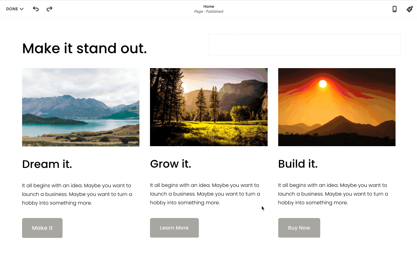
Editing a site on Squarespace often involves manually arranging blocks, which are pieces of content such as text, images, videos, and more.

An example of an image block within a section of a web page
While blocks allow for control and flexibility, they can cause some unwanted work for the user. For example, if a user has three content blurbs, each with an image, a text box, and a button, then reordering those blurbs would require the user to manually drag the images, the text, and the buttons. Our team aimed to solve this problem by creating a system, called Auto Layouts, that would reduce the effort required to arrange content on a web page.
While blocks provide a lot of flexibility, that same flexibility can cause extra manual work for the user.
With Auto Layouts, users can add content and easily rearrange it into different layout styles without manually moving blocks of content. The new layouts would trade some flexibility in exchange for ease of use, consistency of design, and added functionality. In addition, the standard block-based layouts from before would stay available so that the new layouts’ tradeoffs would not sacrifice existing options.
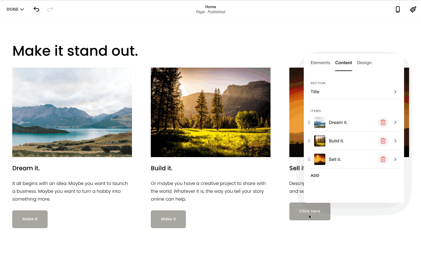
Auto Layouts make it easy to reorder content.

With Auto Layouts, a user can quickly transform the same content into different types of layouts.
When the project’s lead designer showed me the Auto Layout designs, I was deeply impressed. In addition to being beautiful and well-researched, the designs covered lots of use cases and variations in a clear, organized way. On top of that, the designs highlighted possible feature expansions, implementation priority levels, and open questions.

A small sample of the designs in the documents

A zoomed-out view of one of the design documents to give a sense of scale
Because we allow configuration at various touchpoints, it’s almost impossible to iterate every possible layout visually, so when I began considering the technical constraints, I noticed some challenges to the proposed solutions.
Certain combinations of settings may interact in undesired ways. For example, a user who controls column width and space between columns is also implicitly changing the number of visible columns as well as the section’s content width.
How do the various layout settings maintain consistency with the overall site’s width and margins without sacrificing too much control?
Different screen widths add a whole extra set of considerations for each combination of settings.
A project that had made perfect sense on the surface was proving to have lots of unanswered questions.
How did we resolve these questions? Let’s find out!
Preparation
Before sharing my questions, I took the time to write them down and make sure I had clarity on what I wanted to ask. What were our goals and constraints? Which customization options contradicted one another, and how? What were some ways to eliminate the contradictions? For example, if a user wants a carousel layout’s next slide to peek out from the edge of the browser window, selecting a wide space between slides might make this impossible by pushing the peeking slide out of view.
Column width, column count, space between columns, and site margins compete for horizontal space.
Once I had a set of questions and concerns listed, I messaged the project’s design lead to discuss next steps. We agreed on a meeting to address the questions in detail, but first, we used the chat as preparation.
The preparation allowed us to:
Establish background information
Clear up misconceptions
Build a shared understanding of the goals and challenges
Have time to think
Ask questions beforehand
Without this preparation, it would have been easy to end up talking about different things, not having enough time to think, rushing, and later realizing we missed key points. However, preparing beforehand allowed us to have an effective meeting.
Our pre-work was useful because it was focused and interactive. By contrast, it would have been easy to fall into the trap of sending each other a pile of information and expecting that to provide enough context to have a productive discussion.
Meeting
When the time came to meet, the designer and I pulled up the design documents on a shared screen and talked through our questions, adjusting the diagrams in real time. With the documents as a guide, we discussed a prepared list of specific scenarios.

Here’s an example of an Auto Layout section on a website. The content has been set to appear in a carousel format.
For the carousel layout pictured above, we asked ourselves: if we allowed the user to choose the width of each column, what would happen to the number of columns? How would the layout behave on various screen widths? How would the section interact with the overall site margins? From these questions, we realized it wouldn’t make sense to allow users to directly control column width. Instead it made more sense to allow the user to pick a maximum number of columns so the layout’s space could fill automatically. The designer then added a diagram to show this behavior.

A diagram of how the layout’s columns would work
One by one, the designer and I went through many more scenarios like the previous example. Our guiding questions fell into the following patterns:
What happens under specific conditions?
What would this option look like if we diagram it here?
Which constraints are negotiable?
Are there acceptable tradeoffs we can make?
What is the minimum viable solution here?
As we walked through the questions, we made sure to keep the discussion grounded in the user research that the designer had done when producing the initial designs. This helped inform which types of layout customization options to prioritize.
By the end of the meeting, we had a clear idea of how to proceed. Soon after, the design lead came back with a set of diagrams that reflected the real-world technical constraints we discussed in our meeting. Here are a couple of examples showing how to handle a situation where a user wants to have carousel slides peeking out from the edge of the window while also maintaining the structural integrity of the layout.

An illustration of how certain column layout settings can make it impossible for a slide to peek out and tease more content
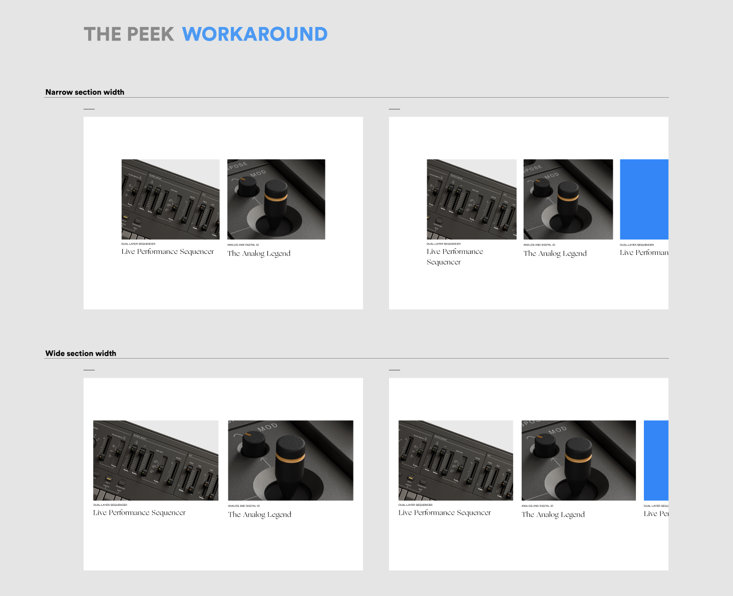
An illustration showing a tradeoff: If the user wants the next slide to peek out from the edge of the window, the right side of the content will be pushed in from the side to guarantee that peek rather than lining up with the right-side page margin.
Three things that made these diagrams effective were:
They showed not just ideal scenarios but also how we might handle challenges and tradeoffs.
They were created early enough in the project that we were able to prevent issues rather than discovering problems too late.
They involved the combined input and experience of design and engineering, coupled with a solid grounding in user research.
Overall, the meeting was a success, and it set us up for a smooth implementation of the project.
Lessons
Building a new type of website section layout brought lessons about how engineering and design can collaborate effectively on a project. Here are some of my favorites:
Make sure the people who have to navigate a project’s requirements are involved in discussing those requirements.
Let meeting participants know the key discussion questions beforehand so they have time to think. This approach can lead to informed opinions and actionable outcomes rather than gut reactions and misunderstandings.
Prefer detailed diagrams over text descriptions when discussing product features to ensure everyone approaches the discussion with shared context.
Walk through concrete scenarios. It’s possible to argue forever about what could happen in theory, but rooting the conversation in specific scenarios can reveal which concerns are valid for the circumstances of the project.
Collaborate early. This can prevent arriving at the middle of a project only to discover it’s too late to change course.
Be deliberate about tradeoffs. Failure to choose among tradeoffs can lead to a compromise that combines the drawbacks of all options.
Listen to each other’s concerns. In a collaborative project, teammates get farther than adversaries.
While this article focused on one instance of collaboration between design and engineering, the project as a whole also involved plenty of input from product managers, copywriters, UX specialists, QA professionals, accessibility experts, and most of all, users. Excluding any of these inputs would have damaged the project.
With that in mind, let’s revisit the riddle from the beginning of this article. How do you make a website look good when you can’t know how that website will look?
My answer would be: decide which tradeoffs are important, and make sure all the right voices are included in that decision.
Auto Layouts are featured in our Fall 2021 marketing campaign.


